The Framework
Learn what makes the Admin app tick, and how plugins work.
In order to follow this guide, you must use Webiny version 5.21.0 or greater.
- the moving parts of the Admin app framework
- what is a plugin
- how the Admin app is rendered
Overview
Admin app is powered by a simple React framework, which allows you to add new React Context providers 


In the following sections, we cover 5 fundamental components which make everything work. These 5 components make up the low-level API, and in the vast majority of cases, these are the only components you’ll need to use to develop new plugins (besides your own custom components and views).
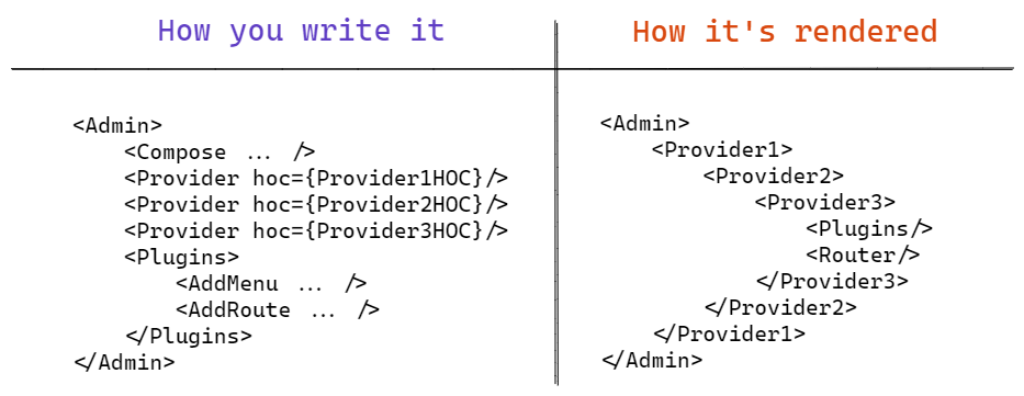
The following diagram shows all 5 components in action:
 Admin App Framework In Action
As you can see, what you mount, is not exactly what gets rendered. The Admin component (the framework) takes care of rendering things where and when they need to be rendered, and also does various compositions and optimizations (caching) in the process.
A good example of that are the React Context providers (represented by the Provider component in the diagram). Traditionally, when using Higher Order Components (HOCs), we end up with a deep hierarchy of nested components, which is hard to read, and even harder to maintain. In these cases, we usually resort to HOC composition, to flatten out the hierarchy, and produce a single component which is constructed of the individual HOCs wrapped around the previous one. We use the same technique to construct React Context providers.
The Provider Component
When building your own plugins, or entire applications, we often need to add one or more React Context providers to share the state between our components, regardless of their location in the component hierarchy. Now imagine you use 10 third-party (or even your own) plugins, and each plugin has its own React Context provider. How annoying would it be to import those providers individually, and mount them one by one?
We make this easy for you, using our Provider component. The component accepts a single HOC, and this allows us to compose providers for you. Here’s an example of a simple Provider HOC implementation:
import React, { createContext } from "react";
import { Provider } from "@webiny/app-serverless-cms";

const MyContext = createContext({});

const MyProviderHOC = PreviousProvider => {
  return function MyProvider({ children }) {
    const myContext = {
      /* context value goes here */
    };

    return (
      <MyContext.Provider value={myContext}>
        <PreviousProvider>{children}</PreviousProvider>
      </MyContext.Provider>
    );
  };
};

// Register a new provider as a child of the <Admin> element
// NOTE: this can be anywhere in the hierarchy, grouped under a custom plugin component, etc.
export const App = () => {
  return (
    <Admin>
      <Provider hoc={MyProviderHOC} />
    </Admin>
  );
};
One of the important characteristics of the Provider component is that, by using it, you can’t interfere with the core setup of the Webiny Serverless CMS, and break it accidentally. Your Providers will always be mounted lower in the hierarchy, after the core Providers.
The Compose Component
The Compose component allows you to wrap (compose) existing React components, that are already used in the existing apps, intercept them at runtime, and change the content that gets rendered.
A good usage example are the menu items in the main navigation of the Admin app.
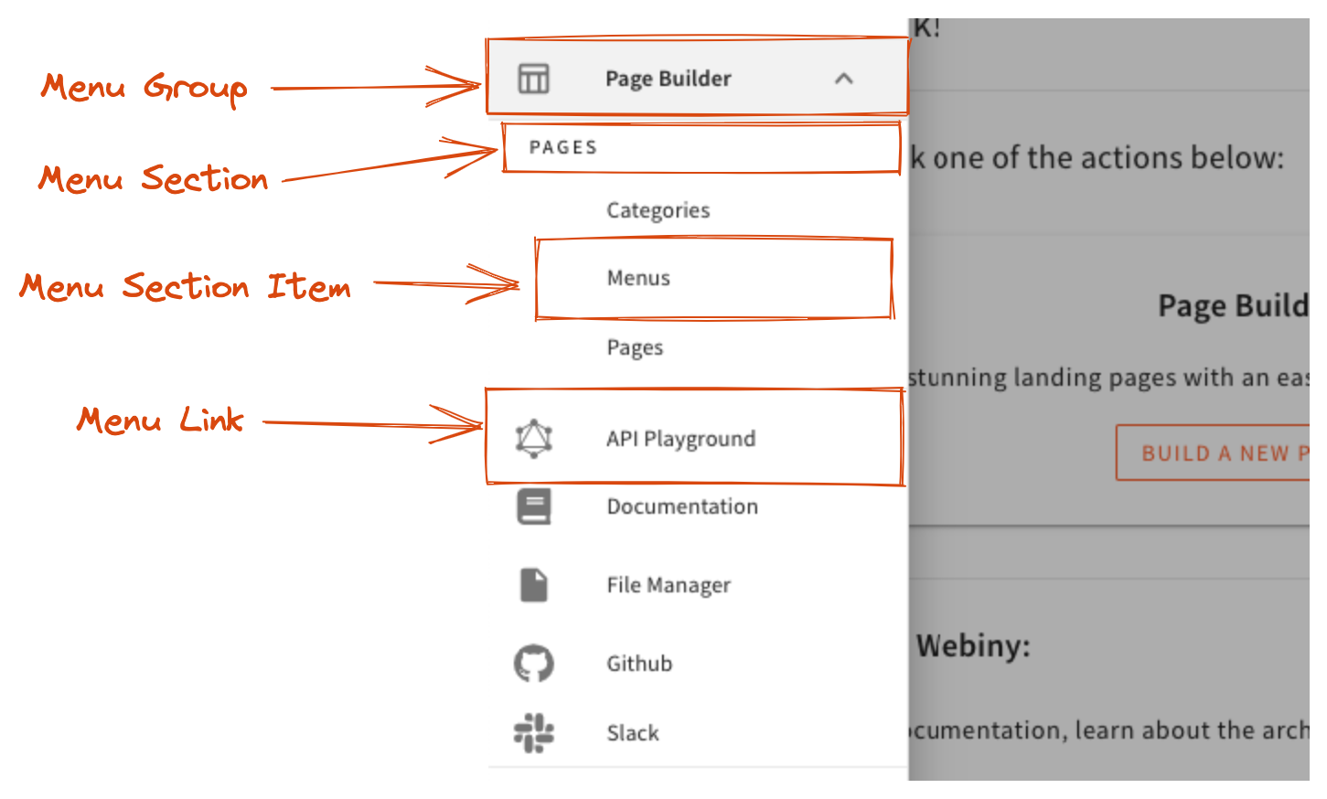
 Navigation Menu Renderers
All the menu items are represented with a single underlying data structure. Depending on menu item’s children, depth (menu within a menu), presence of a link (or an onClick callback), etc., different renderers need to be applied.
Instead of implementing one giant renderer for the entire navigation, we can compose multiple smaller, single-purpose renderers and let them handle individual cases. This also makes it super easy for you to modify individual renderers if the defaults are not the best fit for your project.
Here’s a code example to demonstrate the usage of the Compose component:
import React from "react";
// Import a component you want to compose (in this case, it's MenuItemRenderer).
import { MenuItemRenderer, useMenuItem } from "@webiny/app-serverless-cms";
import { Link } from "@webiny/react-router";

// Implement a HOC to compose with the target component
const MyMenuItemRenderer = OriginalRenderer => {
  return function MyMenuItem() {
    // Use the `useMenuItem` hook to access the current menu item being rendered.
    const { menuItem, depth } = useMenuItem();

    // Decide whether you want to handle this menu item.
    const shouldRender = depth === 0 && menuItem.path;

    if (!shouldRender) {
      // Pass the rendering to the original component.
      return <OriginalRenderer />;
    }

    // Render the menu item!
    return <Link to={menuItem.path}>{menuItem.label}</Link>;
  };
};

// Any time a MenuItemRenderer is mounted, you want to apply your component first.
// NOTE: you can register as many HOCs as you need.
export const App = () => {
  return (
    <Admin>
      <Compose component={MenuItemRenderer} with={MyMenuItemRenderer} />
    </Admin>
  );
};
The Plugins Component
To explain why we need this component, let’s quickly describe what a plugin is.
A plugin is a React component that can do things like adding a route, adding a menu, adding a file type renderer, etc. Plugins can also be composed into larger plugin components, to perform more complex tasks.
More often than not, a plugin component needs to access one or more React Contexts provided by various apps (Page Builder, File Manager, etc.), to do its job. To be able to do that, plugin components need to be rendered as children of all those React Context providers (if unsure, revisit the diagram in the Overview section).
The purpose of the Plugins component is to make sure that its children are rendered at the right place within the app component hierarchy. It helps you not to think about where you mount your plugin components, so you’re more flexible with how you build your custom plugins.
You can mount as many Plugin elements as you need, anywhere in the app components hierarchy. The only important thing is that you do mount it when you want to add one or more plugins to the app.
Here’s the simplest, most straightforward example of using the Plugins component:
import React from "react";
import { Admin, Plugins, AddMenu, AddRoute, Layout } from "@webiny/app-serverless-cms";

// Mount everything as children of the <Admin> element.
export const App = () => {
  return (
    <Admin>
      <Plugins>
        <AddMenu id={"myApp"} label={"My App"}>
          <AddMenu id={"myApp.records"} label={"Records"} path={"/my-app/records"} />
        </AddMenu>
        <AddRoute path={"/my-app/records"}>
          <Layout title={"My App - Records"}>{/* Your UI goes here. */}</Layout>
        </AddRoute>
      </Plugins>
    </Admin>
  );
};
The AddRoute Plugin
This plugin is used to add routes to the Admin app (which we already saw in action, in the previous section). It accepts all the props supported by react-router (which we use under the hood), but since it’s a plugin, we don’t immediately mount the <Route/>. Instead, we register the route internally, and then mount it where and when necessary (as shown in the Overview section diagram).
The AddMenu Plugin
This component is used to add navigation menu items, and supports infinite levels of nesting (as long as your menu item renderers can render them). By default, we provide renderers for the navigation shown in the Compose component section.
The basic usage is already shown in the Plugins component section. With that in mind, let’s show a more advanced example, and demonstrate how it would work with permission checks:
import React from "react";
import {
  Admin,
  Plugins,
  AddMenu,
  AddRoute,
  Layout,
  HasPermission
} from "@webiny/app-serverless-cms";

export const MyPlugin = () => {
  return (
    <Plugins>
      {/* Only mount the top-level menu element if the user has the required permission. */}
      <HasPermission name={"myApp"}>
        <AddMenu id={"myApp"} label={"My App"}>
          {/* Only mount sub-menu element and the corresponding route, if the user has the required permission. */}
          <HasPermission name={"myApp.records"}>
            <AddMenu id={"myApp.records"} label={"Records"} path={"/my-app/records"} />
            <AddRoute path={"/my-app/records"}>
              <Layout title={"My App - Records"}>{/* Your UI goes here. */}</Layout>
            </AddRoute>
          </HasPermission>
        </AddMenu>
      </HasPermission>
    </Plugins>
  );
};

export const App = () => {
  return (
    <Admin>
      <MyPlugin />
    </Admin>
  );
};The only hard rule to be aware of is that you must mount the <Provider/> element outside of the <Plugins/> element. <Compose/> can go anywhere within the <Admin/> element.
Naming Conventions
There are many components exported from the @webiny/app-serverless-cms package. These naming conventions will help you find your way around, and quickly filter out components in your IDE.
- components that add things to the system start with
Addprefix (e.g.,AddMenu) - presentation components end with
Renderer(e.g.,MenuItemRenderer) - hooks, by React convention, start with
use(e.g.,useSecurity)
Almost always, renderer components go with a parent component that provides a React Context to the renderer. For example, a UserMenuItem has a corresponding UserMenuItemRenderer component. The renderer component doesn’t take any props; instead, it uses hooks to fetch the relevant data from React Context, provided by the UserMenuItem component. This approach drastically reduces prop drilling, and makes it easier to decouple logic from presentation. This topic will be covered in more details in a dedicated article.
If you want to change the appearance (the renderer) of a certain component, always look for the Renderer part of it, and compose that component.
Helper Functions
Now that you know the low-level mechanisms, we can introduce the following utility functions to make the process easier and more straightforward.
createComponentPlugin
This function takes a composable component and a HOC, and returns a new component which, when mounted, registers the HOC into the composition provider:
import { createComponentPlugin, MenuItemRenderer } from "@webiny/app-serverless-cms";

// Create a plugin for a composable component.
const MyMenuItemPlugin = createComponentPlugin(MenuItemRenderer, Original => {
  return function MyMenuItemRenderer(props) {
    return <Original {...props} />;
  };
});

// Mount the plugin in your Admin app.
export const App = () => {
  return (
    <Admin>
      <MyMenuItemPlugin />
    </Admin>
  );
};
createProviderPlugin
This function creates a component which, when mounted, registers an admin app provider:
import { createProviderPlugin } from "@webiny/app-serverless-cms";

// Create an Admin provider plugin.
const MyProviderPlugin = createProviderPlugin(PreviousProvider => {
  return function MyProvider({ children }) {
    return (
      <MyContextProvider>
        <PreviousProvider>{children}</PreviousProvider>
      </MyContextProvider>
    );
  };
});

// Mount the plugin in your Admin app.
export const App = () => {
  return (
    <Admin>
      <MyProviderPlugin />
    </Admin>
  );
};
Conclusion
These few simple components is what makes up the core of the Admin app. This provides strong and simple foundations to build upon. It’s easily composable, and gives the ability to lazy-load plugins, apply plugins conditionally, compose component renderers, and also compose these atomic components into larger plugins.
In the prior versions of Webiny, we relied on a global plugins registry, and plugins as objects. This approach still works, and all your existing plugins will work as if nothing changed.
However, the core Webiny apps will slowly be transitioning to this new React based API, and we’ll be exposing more plugin components as we go.